

1
2
3
4
5
6
7
8

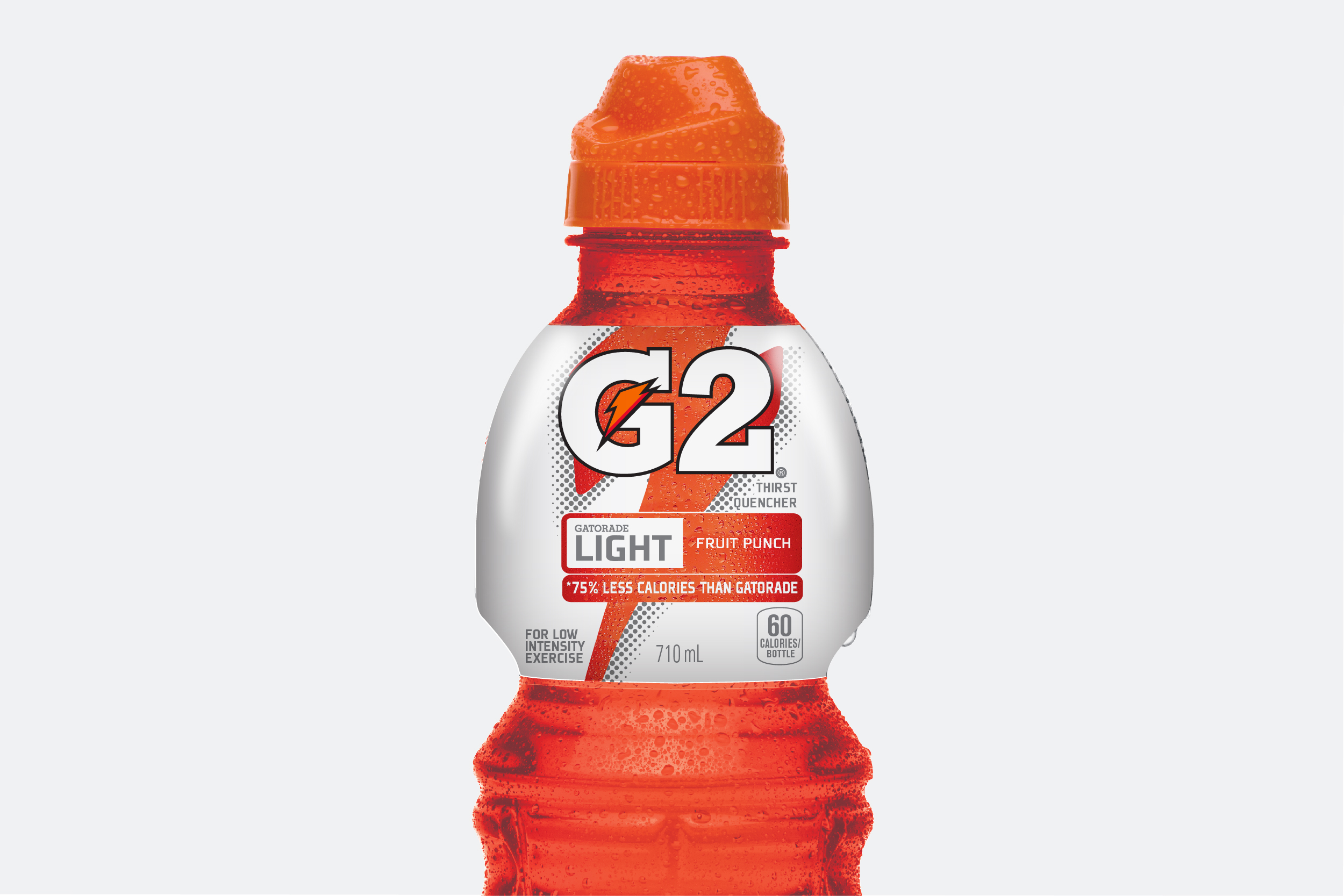
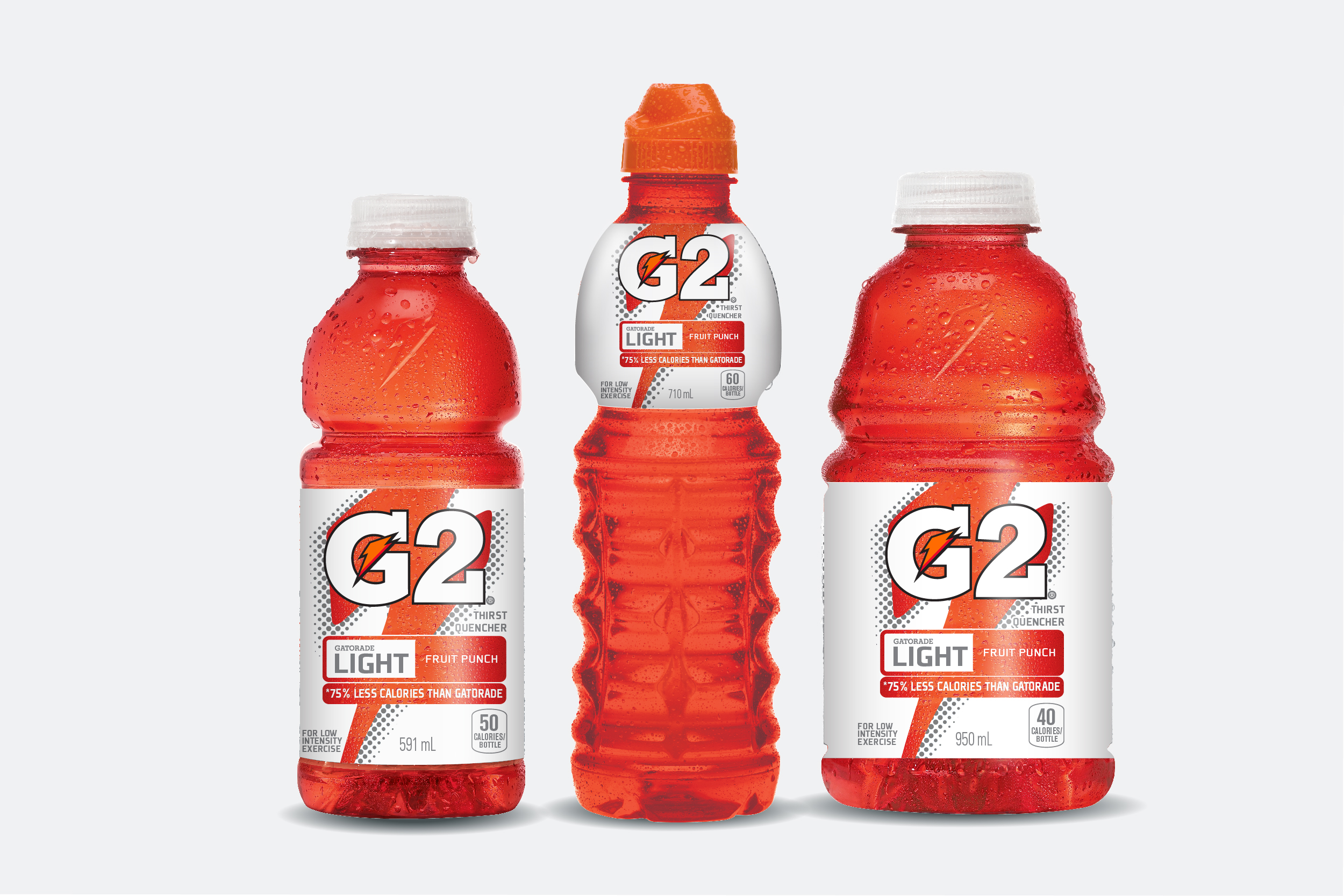
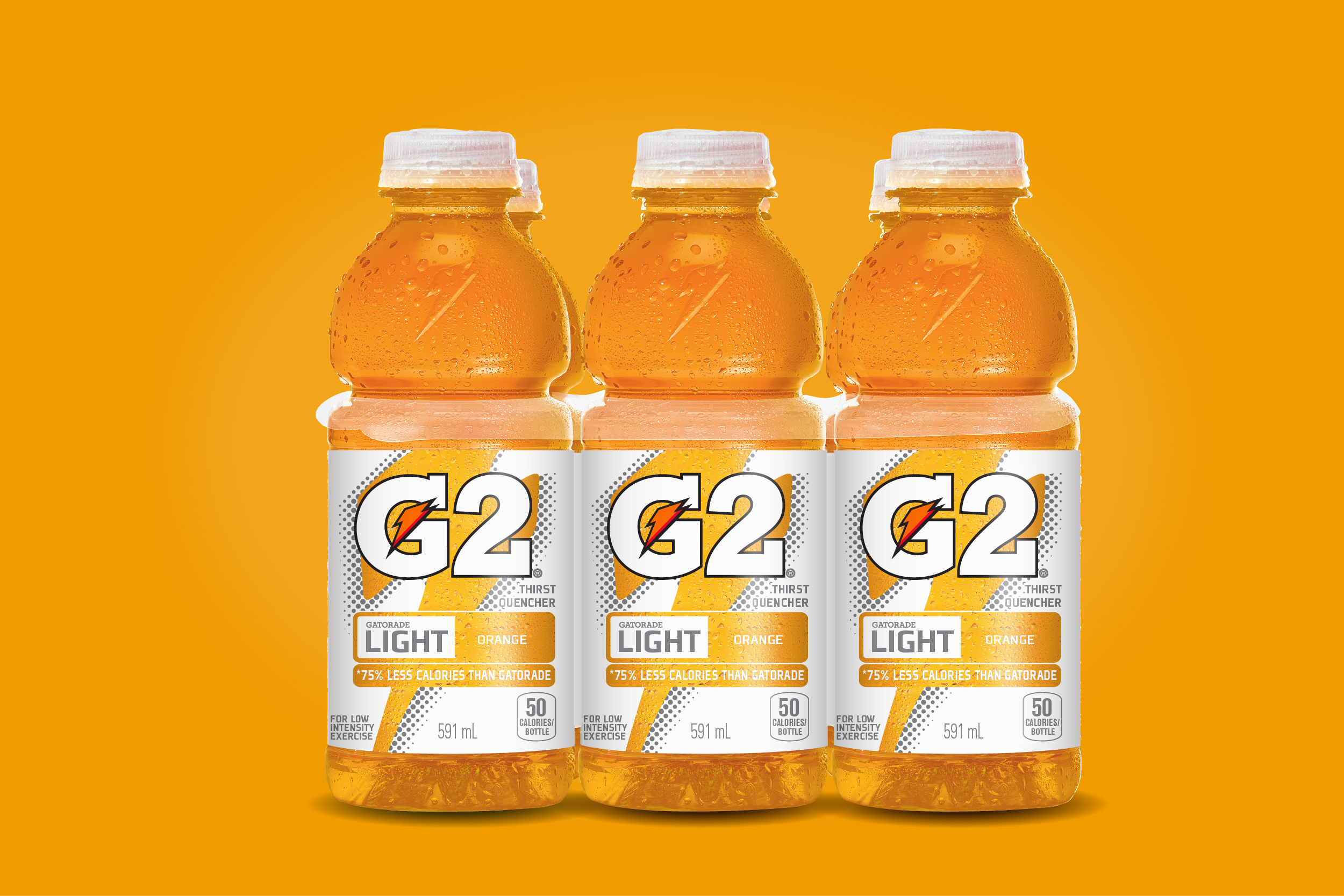
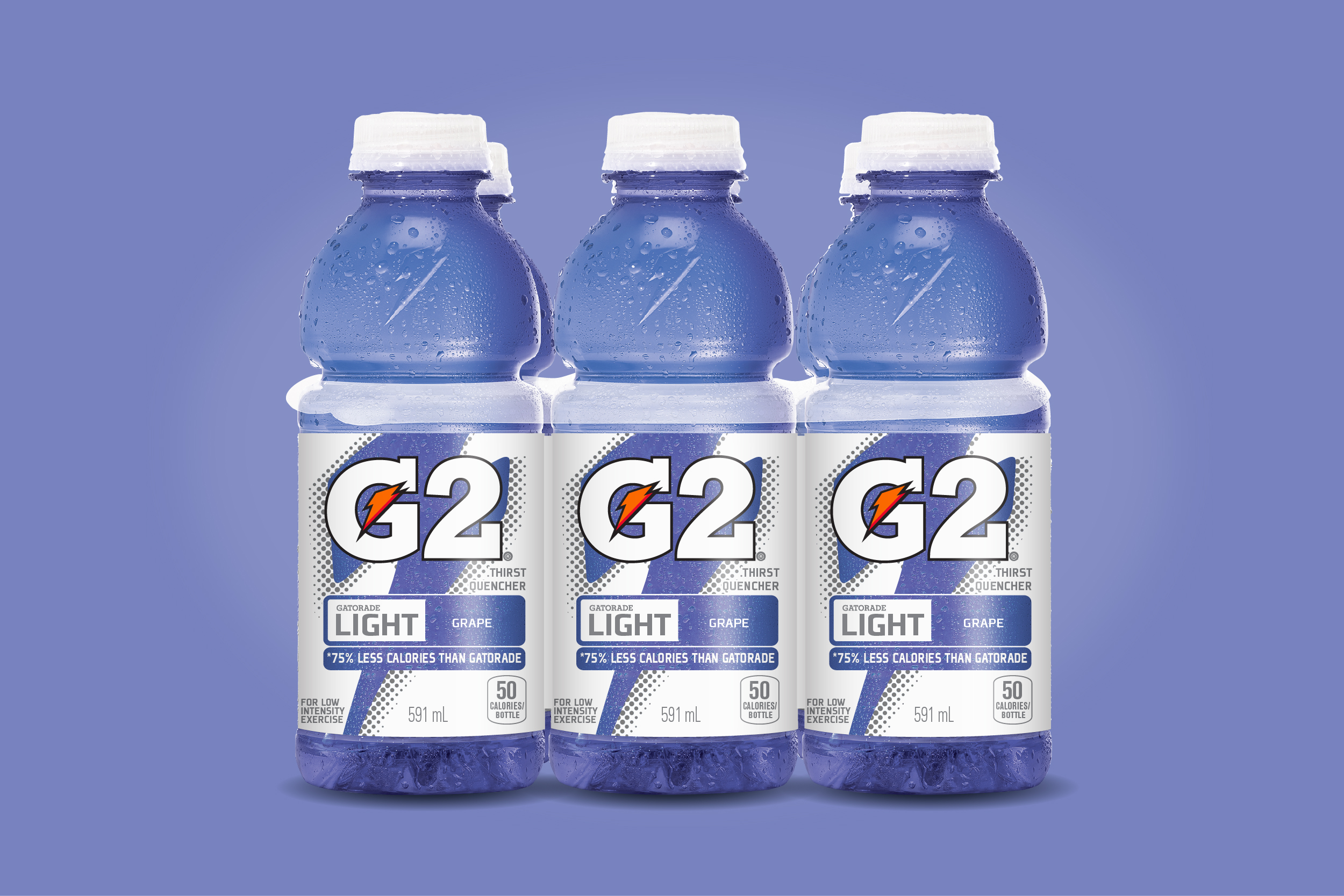
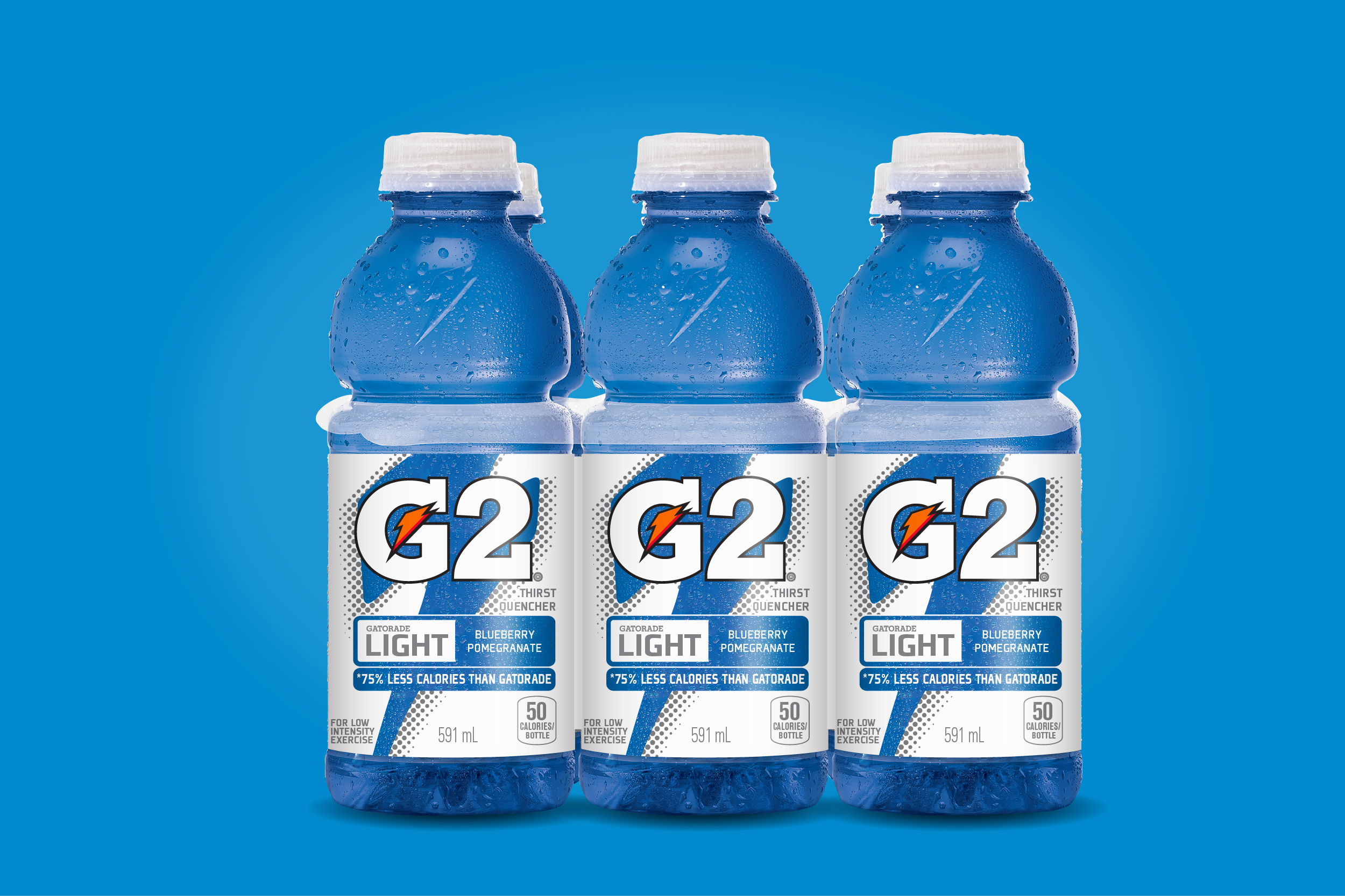
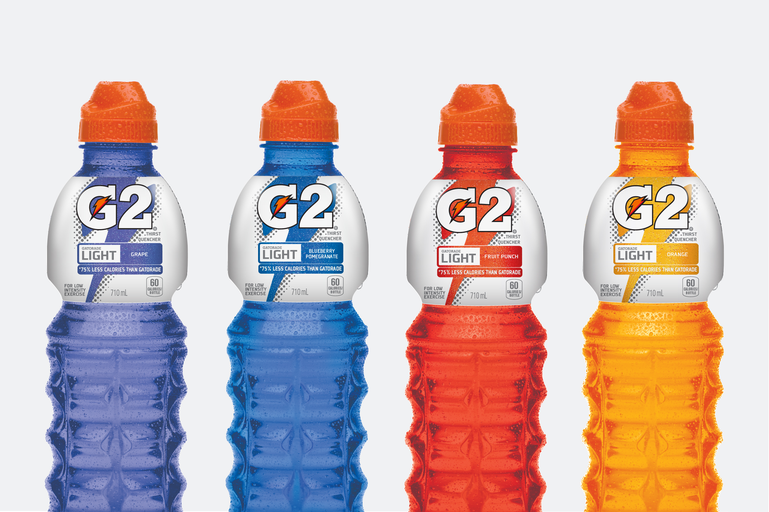
Re-invigorate the G2 brand and its position in the ISO shelf set by re-designing the label/packaging graphics to make it stand out .The challenge was to consider how to differentiate packaging enough to consumers that they recognize they are two different products with two different need states. G2 is the lighter low calorie offering of the gatorade products we looked at ways to the differentiate by utilizing more white space on the label to give it a sense of light feeling, the claims helped support the new position & help separate the gatorade lineup.